
Tuesday, November 29, 2011
Monday, November 28, 2011

Sunday, November 27, 2011
Rauschenberg InspiredFashions
 |
Art can also be a great thing to look at for fashion. The color palette on the left is literal with the blue, orange and beige. The jacket has a baroque pattern on it which somehow goes with the old style images of woman screen printed in. Some of the newsprint is peaking through from beneath, it has a very vintage feel to it. The dress i chose is to represent the newspaper. It has wonderful pleats on the top and a nice texture on the bottom like the splotches of paint. The round necklace with the repeating circles mimics the target on the painting. I think it captures the clean lines and texture that the painting has while also being very abstract. The one the right was inspired by the flow of the painting, paint drips, and the ombre technique of the blues and beige. The scarf has a gradient from white to blue and is similar to the top of the painting. The chaos of the paint strokes is shown by the shirt which has an ombre look and paint splatter. A pop of red in the shoes implies the one spot in the composition. I also tried to match ratio of color since the browns and whites were most prominently used |
My Opinion
Upon first viewing Rauschenberg's work it appeared chaotic and a big jumble of pictures. I didn't know what to think of it or what to take from it. He had so many mediums that he dabbled in, that it was hard to follow his focus. I'm not a huge fan of abstract expressionism or of found objects being considered an art form. Then again it all depends on the story you give to it and how its changed or improved. Some of his lithographs first appealed to me do to their simplistic and graphic nature. Only after reading through his quotes did i realize why he created what he did. Not to be pretty or for someone else to like it, but to jumble through the chaos of the time or decade and to show the world the essence of the time, even if they never lived in it. I liked the idea of thinning out the separator between art and reality and how the two can cross over. Art can be anything if it has meaning to a person. The fact that he never planned out his compositions baffled me. They seem so perfectly placed and yet completely random at the same time. One of these days I will have to let my inhibitions run free and just let the art do the talking. His creations allow for open interpretations. The meaning is not clearly written out nor is the image itself. We all get different things out of art. Rauschenberg completed a huge variety of things when it came to the arts. I have never seen such an extensive range of artistic talent before. Sure somethings might not be considered true talent like tying a piece of cloth or putting a tire on the wall, but that's what makes his stuff so interesting. When I heard he erased a de Kooning drawing I thought he was nuts, that is until he explains things. Art is in the creating, not the creation. His compositions were really interesting and varied with the overlapping pictures and build up of paint. Some of my favorite works of his would have to be the Combines. They had depth and texture and became incorporated into the real world, not just a picture to stare at. He wasn't trying to be different or original. In fact I'm not so sure he cared. He just made art because it made him content.
Friday, November 25, 2011
Art Inspiring Interior Design
 |
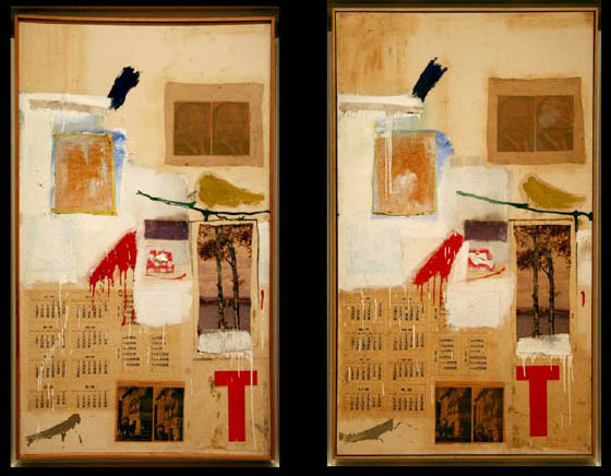
| Storyline III |
Art can inspire many things and can also set the tone for a room, however it can inspire all the elements in the design. Aspects such as color, line, texture, size, proportion and tone can all come into play when deciding what elements in a room. I created this set to show how Rauschenberg's art can look in a room. This example may be a little feminine for his artistic style but when broken down, the elements really make sense for why i chose them. First, color is the most obvious element pulled out of his work. The neutral base with the pop of fuchsia really caught my eye. I brought the color in minimally through accessories. The rest of the decor was added to the match the color scheme of whites, beige, black, and pink. The wooden cart coffee table is similar to a crate Rauschenberg created in 1953. The beige pillow on the right side of the couch is a similar print to the "Samarkand Stitches" with it Ikat print. His metal sculptures like the "Glut" series translates well into a metal side table. Texture was very prominent in Rauschenberg's early works in the 1950s. I brought in texture through the pillows and wooden ball on the side table which reminds me of the works done with cardboard. The rug was just an interesting graphic touch to pull the whole room together.
Wednesday, November 23, 2011
Art in The 1980's and 1990's
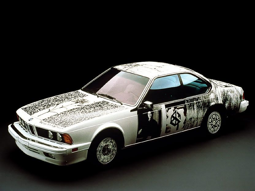 |
| BMW 1986 |
 |
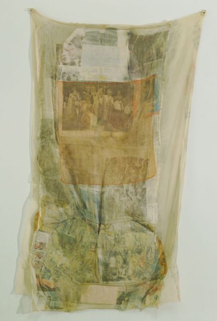
| Samarkand Stitches 1988 |
 |
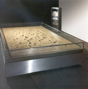
| Untitled 1980 |
 |
| Soviet American Array |
.  | |||
| Mercury Zero Summer Glut 1987 |
He reverted back to simplistic picture collages without paint or bunched paper. His sculptures became much more simplistic, clean and slightly geometric. He did a series of Bicyloids that were made from neon lights wrapped around bikes. The "Echo Echo" sculpture of the windmill is particularly interesting. Each blade has different images on it. A wheel or spinning circle seemed to a common theme in Rauschenberg's work.
Monday, November 21, 2011
Art in the 1970's
 |
| Skyrite 1969 |
 |
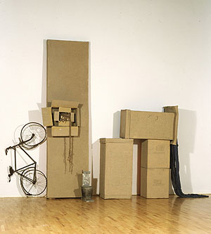
| Bones and Unions 1975 |
 |
| Mude-Muse 1971 |
 |
| Sor Aqua 1973 |
 |
| Hoarfrost Series 1975 |
 |
| Early Egyptian 1973 |
 |
| Bones to Union 1975 |
 |
| The Lamp 1971 |
 |
| Opal Gospel 1971 |
 |
| Arcadian 1977 |
 |
| Signs 1970 |
 |
| Franciscan II 1972 |
 |
| Mint 1974 |
Sunday, November 20, 2011
Art in the 1960s
 |
| Solstice I 1968 |
 |
| Storyline I 1965 |
 |
| Dry Cell 1963 |
 |
| Skyway 1964 |
 |
| Tracer 1964 |
 | ||
| Pelican 1963 |
 | |
| Express 1963 |
 |
| Accident 1963 |
 |
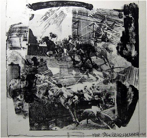
| Ace 1962 |
 |
| Navigator 1962 |

 |
| Trophy IV 1961 |
 |
| First Landing Jump 1961 |
Wednesday, November 16, 2011
Art in the 1950's
 |
| Canyon 1959 |
 |
| Bride's Folly 1959 |
 |
| Untitled 1955 |
 |
| Monogram 1955-59 |
 |
| Monogram 1955 |
 |
| Bed 19555 |
 |
| Minutiae 1954 |
 |
| Red Import 1954 |
 |
| Charlene 1953 |
 |
| Collection 1953 |
 |
| Untitled 1952 |
 |
| Tire Print 1951 |
 | |||||
| Factum II 1957 |
Monday, November 14, 2011
Erased de Kooning
Rauschenberg was always looking for a different way to make art or take something plain and make it art. But what about taking a work of art and removing the very thing that made it art in the first place? Would it still be art? Well after Robert erased a drawing by the famous Willem de Kooning, he saw it as art. At first the thought of this may sound a little crazy and disrespectful. This erased drawing was to be an addition to the white paintings he previously created. Instead of the blank canvas lacking an image due to a reduced form of addition to the canvas, a way was created to achieve the same outcome by subtraction. Previous drawing were too easy to erase and had no meaning during the act of erasing it.He needed something extremely difficult to erase like the drawing of de Kooning due to the fact that they were created with ink and crayon on paper. Robert was actually a fan of de Kooning's work and thought that when asking him if he could erase one of his images, that he would say no. He actually was hoping for a rejection just to turn that into an art form. None the less, de Kooning agreed and gave Robert an extremely difficult drawing to erase with many layers. The process itself took nearly a month to get rid of any marks. While doing it, Robert felt a sense of being empowered. While the image is gone the process of getting there tells the story and is the reason why the blank image is still meaningful. It questions if a material object is still important when the thing that made it special in the first place is gone. Take the Mona Lisa for instance. Its one of the most well known paintings in the world. Imagine the paint just faded or disappeared. The actual canvas is still present but there's no image. I believe the object itself is still just as important as what we see. As long as we retain the memory of the way we feel when seeing the painting, the actual material object should still be kept and displayed. Its not the way it looks in the present but its the journey that it took getting to that point. An artwork shouldn't be admired for its present state but rather every state its ever taken shape. Rauschenberg knew what he was doing when "defacing" de Kooning's work. Its a psychological process that makes people question what true art means.
 Follow this link for more info on The Erased de Kooning

Background
Rauschenberg had decided to become an artist after an unsuccessful time studying pharmacology and enrolling into the US Navy during world War II. His educational background was very extensive. After getting a typical art education at the Kansis City Art Institute, Robert studied abroad at the Academie Julian in Paris which helped broaden his worldly view. There he met his future wife Susan Weil, also an artist, whose work was similar in terms of combining pictures in an abstract way, yet was not nearly as developed as her husband.
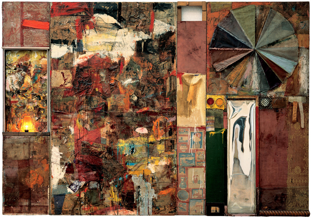
Upon returning to the United States, Robert studied at Black Mountain College in North Carolina. The education was very different than his previous courses. Earlier on in his education, the goal was to paint only under the influence of great master and to develop a classical style. Albers, a professors at Black Mountain, taught Robert to do the exact opposite of what he knew and to develop his own style. Robert discovered that art was all about experimentation and self discovery. In 1951, Robert had his own solo exhibition at the Betty Parsons Gallery in New York. The focus of this show was a new series of paintings call the white, black and red paintings. The white paintings were monochromatic and there purpose was to "reduce painting to its most essential nature." Anyone viewing these paintings would think it was a displayed blank canvas with no art on it. When thought about a little further, the blank canvas becomes complex based on its surroundings. Light and shadow bounce off the canvas depending on people around it. " The smallest adjustment of light is registered on the surface." This blank canvas is in fact not blank at all when contrasted with the real world. Its an ever changing work of art.
 The black paintings incorporated newsprint and were painted upon to let sections of the paper peek out from underneath. It had multiple panels of different shades of black.
 The red paintings were applied with different painting techniques for texture and variation. He would include other objects such as newsprint, wood and nails. This was the beginning stages for his "Combines" which included found objects that were renewed in meaning by its context.
 In 1958, Robert spent two and a half years creating a project based on the 34 Cantus of Dante's Inferno. He took magazine photos and solvent transfer techniques to create his own drawings.

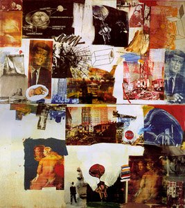
 In the 1960's, Robert played around with different mediums. In addition to the use of found objects, he tried printmaking and performance art. He would take photographs and silk screen them onto his paintings. Many of the images had to deal with the lifestyle and politics of the 1960's. He was called a Pop artist and related to Andy Warhol for his use of recognizable symbols being recreated in different colors and repeated.
 This painting reveals the essence of the 1960's with the use of John F. Kennedy, who is prominent in many of Robert's works, and the expansion of the human race through space travel, inventions and equal rights. He captured most things that made the 60's what it was known for while including an interesting perspective with colorful images.
 |
| Sample of Susan Veil's work. |
Subscribe to:
Comments (Atom)