
Tuesday, November 29, 2011
Monday, November 28, 2011

Sunday, November 27, 2011
Rauschenberg InspiredFashions
 |
Art can also be a great thing to look at for fashion. The color palette on the left is literal with the blue, orange and beige. The jacket has a baroque pattern on it which somehow goes with the old style images of woman screen printed in. Some of the newsprint is peaking through from beneath, it has a very vintage feel to it. The dress i chose is to represent the newspaper. It has wonderful pleats on the top and a nice texture on the bottom like the splotches of paint. The round necklace with the repeating circles mimics the target on the painting. I think it captures the clean lines and texture that the painting has while also being very abstract. The one the right was inspired by the flow of the painting, paint drips, and the ombre technique of the blues and beige. The scarf has a gradient from white to blue and is similar to the top of the painting. The chaos of the paint strokes is shown by the shirt which has an ombre look and paint splatter. A pop of red in the shoes implies the one spot in the composition. I also tried to match ratio of color since the browns and whites were most prominently used |
My Opinion
Upon first viewing Rauschenberg's work it appeared chaotic and a big jumble of pictures. I didn't know what to think of it or what to take from it. He had so many mediums that he dabbled in, that it was hard to follow his focus. I'm not a huge fan of abstract expressionism or of found objects being considered an art form. Then again it all depends on the story you give to it and how its changed or improved. Some of his lithographs first appealed to me do to their simplistic and graphic nature. Only after reading through his quotes did i realize why he created what he did. Not to be pretty or for someone else to like it, but to jumble through the chaos of the time or decade and to show the world the essence of the time, even if they never lived in it. I liked the idea of thinning out the separator between art and reality and how the two can cross over. Art can be anything if it has meaning to a person. The fact that he never planned out his compositions baffled me. They seem so perfectly placed and yet completely random at the same time. One of these days I will have to let my inhibitions run free and just let the art do the talking. His creations allow for open interpretations. The meaning is not clearly written out nor is the image itself. We all get different things out of art. Rauschenberg completed a huge variety of things when it came to the arts. I have never seen such an extensive range of artistic talent before. Sure somethings might not be considered true talent like tying a piece of cloth or putting a tire on the wall, but that's what makes his stuff so interesting. When I heard he erased a de Kooning drawing I thought he was nuts, that is until he explains things. Art is in the creating, not the creation. His compositions were really interesting and varied with the overlapping pictures and build up of paint. Some of my favorite works of his would have to be the Combines. They had depth and texture and became incorporated into the real world, not just a picture to stare at. He wasn't trying to be different or original. In fact I'm not so sure he cared. He just made art because it made him content.
Friday, November 25, 2011
Art Inspiring Interior Design
 |
| Storyline III |
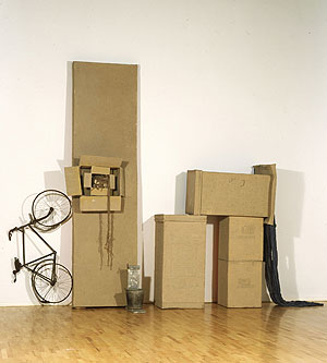
Art can inspire many things and can also set the tone for a room, however it can inspire all the elements in the design. Aspects such as color, line, texture, size, proportion and tone can all come into play when deciding what elements in a room. I created this set to show how Rauschenberg's art can look in a room. This example may be a little feminine for his artistic style but when broken down, the elements really make sense for why i chose them. First, color is the most obvious element pulled out of his work. The neutral base with the pop of fuchsia really caught my eye. I brought the color in minimally through accessories. The rest of the decor was added to the match the color scheme of whites, beige, black, and pink. The wooden cart coffee table is similar to a crate Rauschenberg created in 1953. The beige pillow on the right side of the couch is a similar print to the "Samarkand Stitches" with it Ikat print. His metal sculptures like the "Glut" series translates well into a metal side table. Texture was very prominent in Rauschenberg's early works in the 1950s. I brought in texture through the pillows and wooden ball on the side table which reminds me of the works done with cardboard. The rug was just an interesting graphic touch to pull the whole room together.
Wednesday, November 23, 2011
Art in The 1980's and 1990's
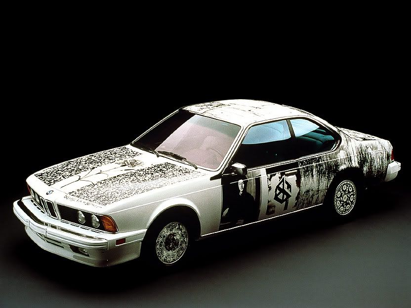 |
| BMW 1986 |
 |
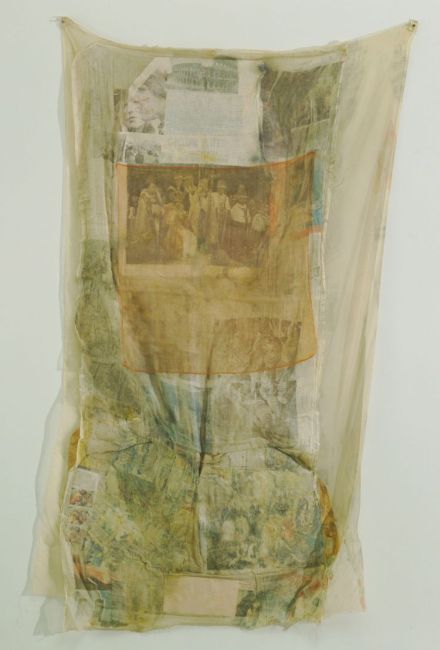
| Samarkand Stitches 1988 |
 |
| Untitled 1980 |
 |
| Soviet American Array |
.  | |||
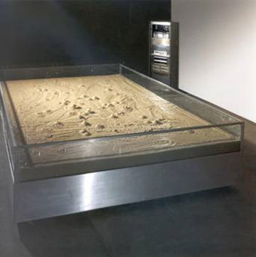
| Mercury Zero Summer Glut 1987 |
He reverted back to simplistic picture collages without paint or bunched paper. His sculptures became much more simplistic, clean and slightly geometric. He did a series of Bicyloids that were made from neon lights wrapped around bikes. The "Echo Echo" sculpture of the windmill is particularly interesting. Each blade has different images on it. A wheel or spinning circle seemed to a common theme in Rauschenberg's work.
Monday, November 21, 2011
Art in the 1970's
 |
| Skyrite 1969 |
 |
| Bones and Unions 1975 |
 |
| Mude-Muse 1971 |
 |
| Sor Aqua 1973 |
 |
| Hoarfrost Series 1975 |
 |
| Early Egyptian 1973 |
 |
| Bones to Union 1975 |
 |
| The Lamp 1971 |
 |
| Opal Gospel 1971 |
 |
| Arcadian 1977 |
 |
| Signs 1970 |
 |
| Franciscan II 1972 |
 |
| Mint 1974 |
Subscribe to:
Posts (Atom)